
Case study
Setrik Scan: a website for my own iPhone app
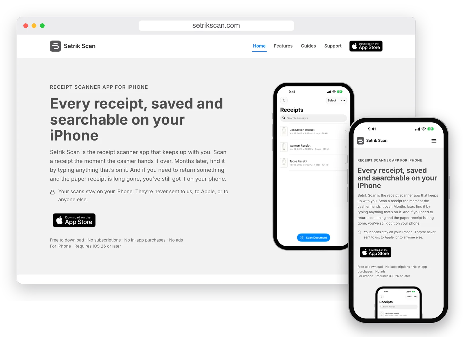
Setrik Scan is an iPhone app I designed and built. It turns receipts and paperwork into clean, searchable PDFs that stay on your phone. Here’s how I planned and built its website, setrikscan.com, to explain the app plainly and lead people to the App Store.
The product
What Setrik Scan is, and who it’s for
Setrik Scan is my own product. Alongside web design, I also develop apps for iOS, Mac, and Windows. It’s another adventure of mine, and Setrik Scan is the first one out in the world.
The app does one job well. You point your iPhone at a piece of paper, and Setrik Scan saves it as a clean PDF you can search by any word inside it. You can sign a form without printing it, keep papers in folders, and send a document to any phone.
It’s built around receipts. Scan one at the register, and months later you can find it by typing the store name or anything else printed on it. If you need to return something and the paper receipt is long gone, the copy on your phone is still there. Medical results, bills, and other important papers come next.
It’s for everyday iPhone owners, not tech people: shoppers who keep receipts for returns and warranties, people tracking expenses or taxes, and anyone with a drawer full of papers they’d rather have on their phone.
At a glance
An iPhone app on the App Store
Free to download, with no subscriptions, in-app purchases, or ads
Scans stay on the iPhone; the app never sends them anywhere
Receipts first, then any paper worth keeping
The goals
Four jobs for one small website
A website for an app has a narrower job than most business sites. It doesn’t take orders or book appointments. It has to answer questions and lead people to one button.
Answer the privacy question first
When I showed the app to people, about two out of three asked the same thing before anything else: where do my scans go, and can you see them? The site had to answer that before anyone had to ask.
Show the app, not just describe it
People decide quickly about apps. Real screens from the app say more than a paragraph of features ever could.
Help people who have a paper in hand
Most people looking for a scanner app have a receipt or a form in front of them right now. Guides that answer their exact question bring them in.
Lead to one next step
Every page ends in the same place: the App Store, through Apple’s own download badge.
How the site does it
How each part of the site serves that purpose
Every section on setrikscan.com is there for one of those four jobs. Here’s how they fit together.
Privacy is on every page, not buried in a policy
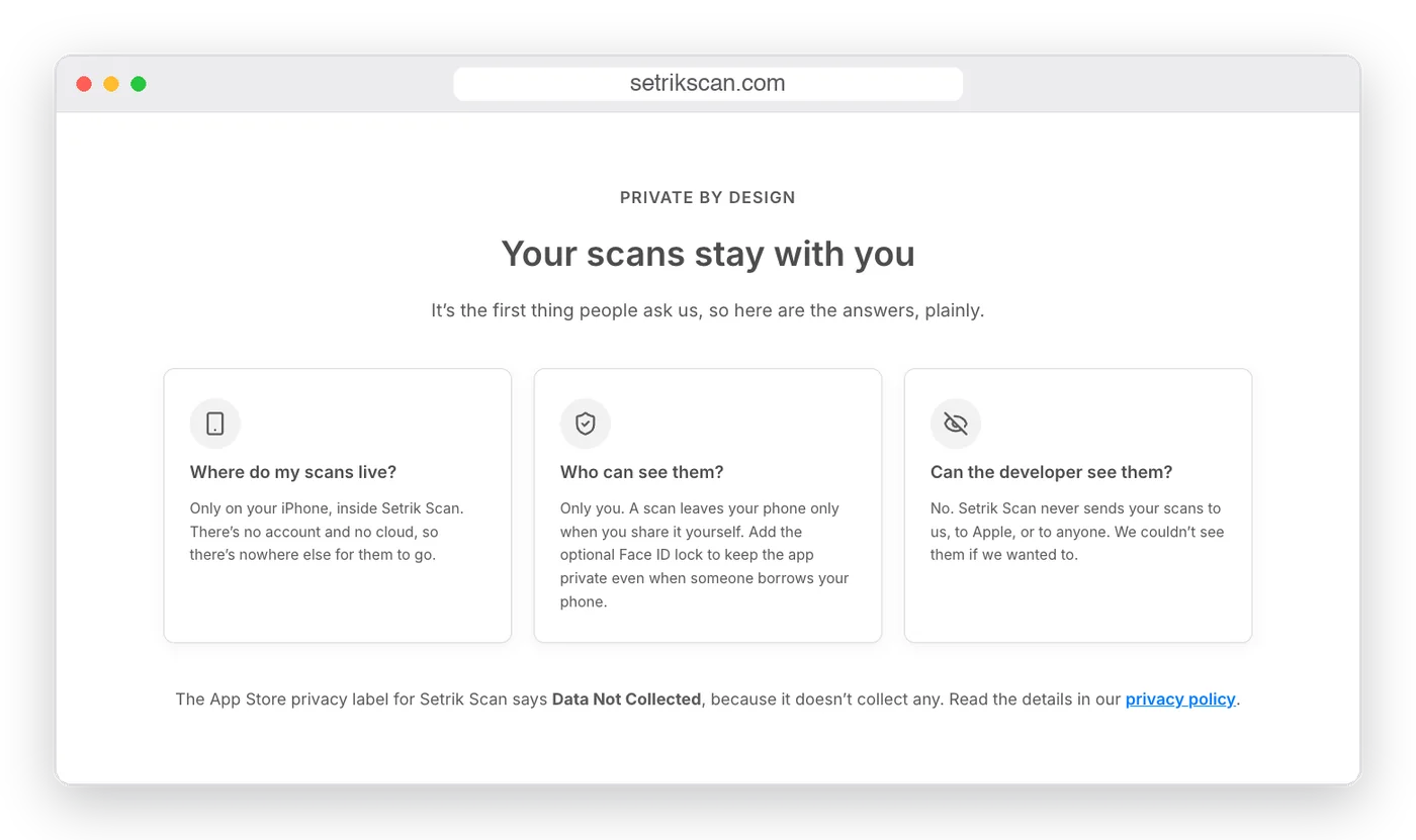
The home page says it in the first screen: your scans stay on your iPhone, and Setrik Scan never sends them to us, to Apple, or to anyone else. Further down, a full section answers the three questions people actually ask, in plain words. Every feature page and every guide says it again at least once.
I was careful with the wording. Every promise is about the app, and every one is exactly true. There are no “military-grade” or “bank-level” claims. The plain facts do the convincing: no account, no server, and Apple’s “Data Not Collected” label.
Real app screens tell the story
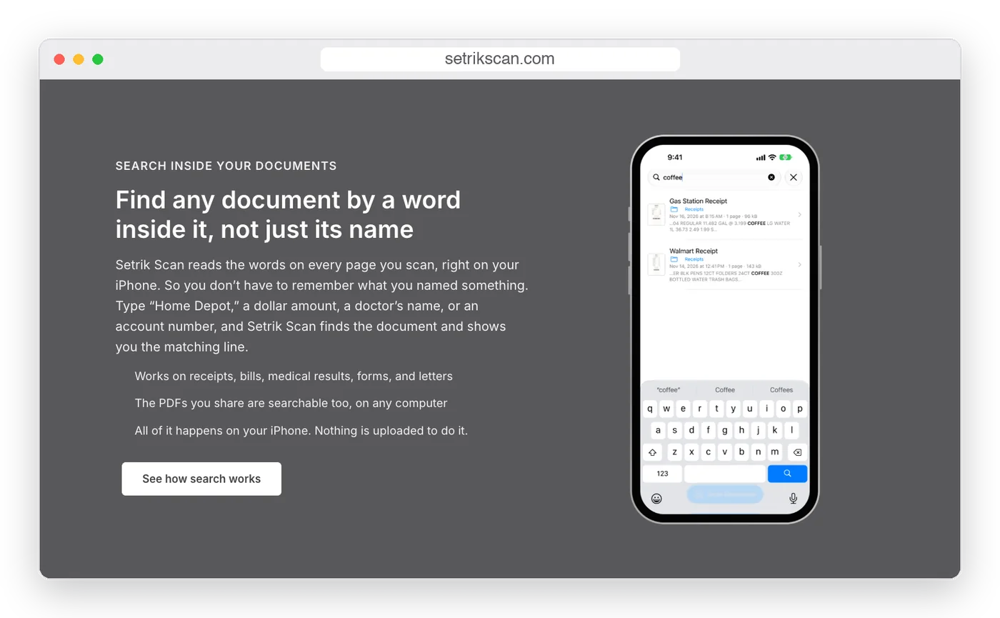
Instead of stock photos, the site uses screenshots from the app itself, set in an iPhone frame. The search section shows the app finding receipts by the words printed on them, so a visitor understands the main feature at a glance.
The design follows the app, too: the same quiet gray, the same simple icons, and plenty of white space, so the website and the app feel like one product.
One page for each feature
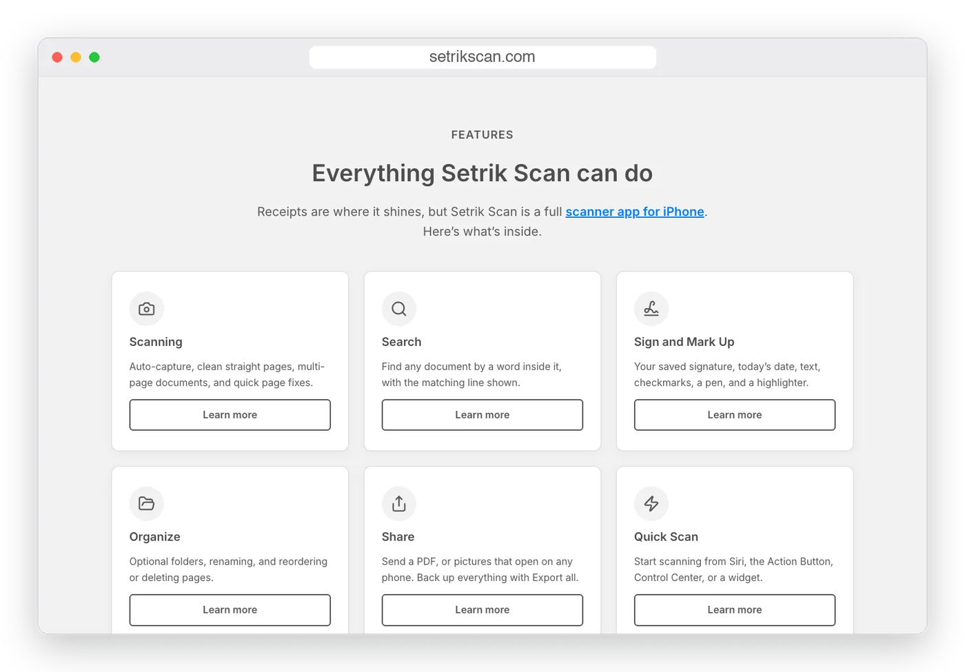
Scanning, search, signing, organizing, sharing, quick scan, and privacy each have their own page. Someone who only cares about signing forms can read just that, and each page has room to answer that feature’s questions properly.
It also gives Google a clear page to show for each topic, instead of one long list that tries to rank for everything.
Guides that start with the reader’s question
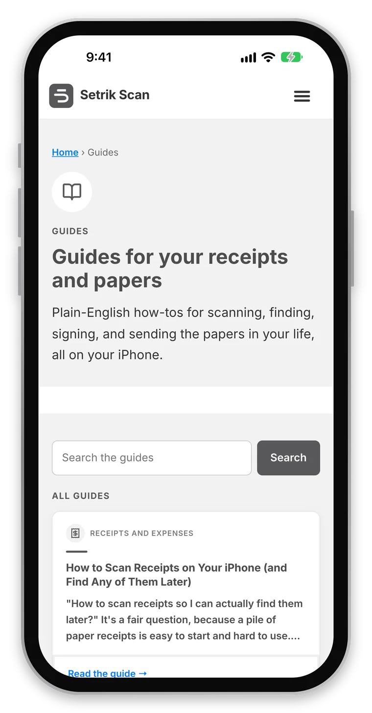
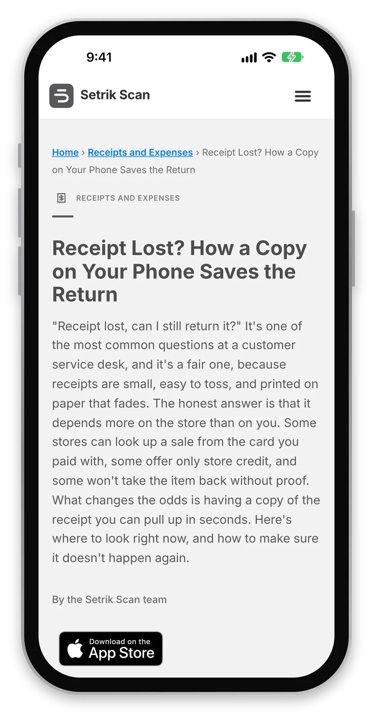
The guides are how most new visitors will find the site. Each one targets a real question people type into Google, chosen through keyword research: how long to keep receipts for taxes, what to do when you’ve lost a receipt, how to sign a PDF on an iPhone.
Each guide answers the question honestly first, then shows where Setrik Scan helps. The guide library has search, topics, and nine guides to a page, and new guides appear there on their own when they’re published.
Support answers questions before anyone has to email
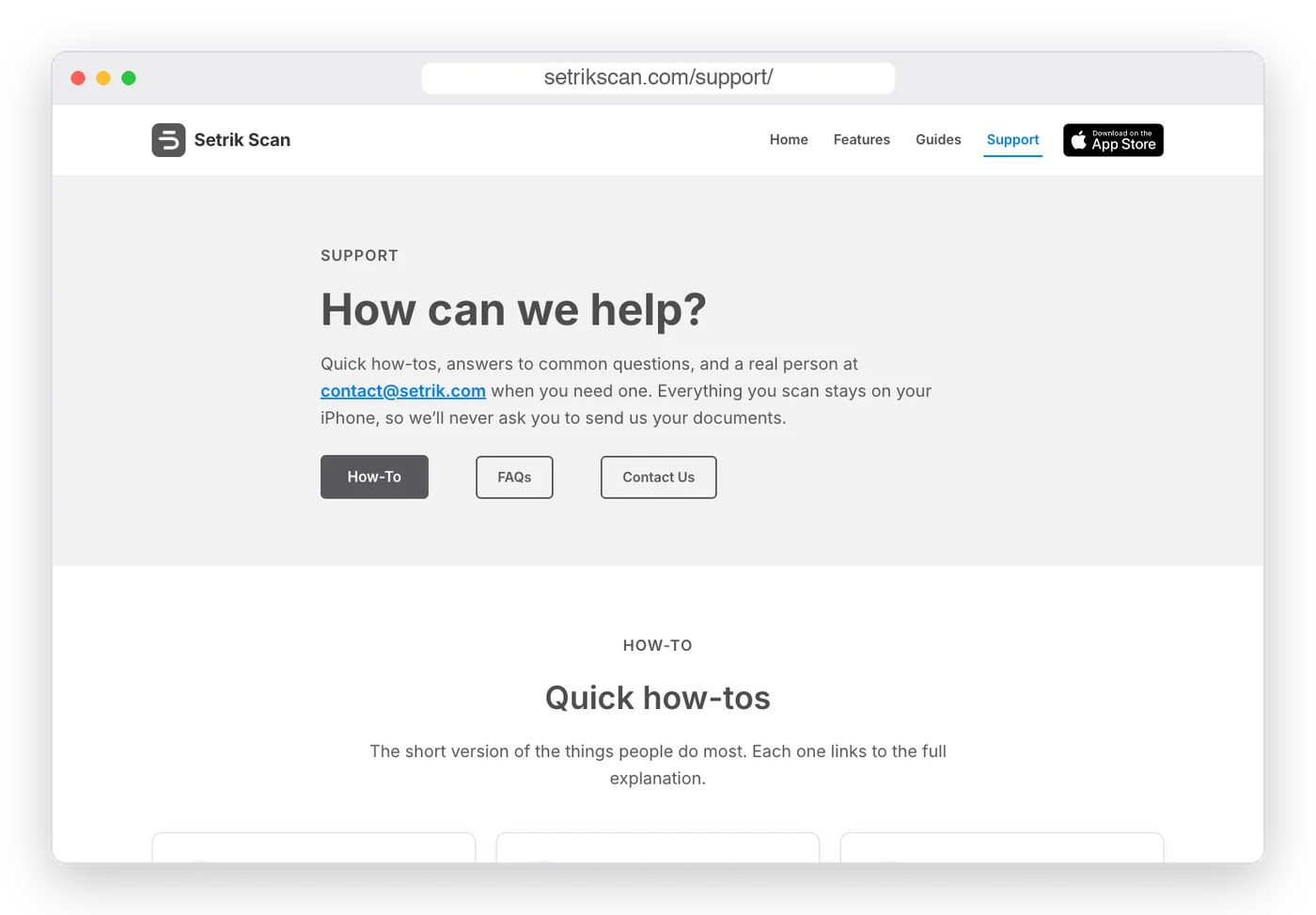
The Support page covers the how-tos and the questions people ask most: where scans are stored, what happens if you delete the app, and whether there’s a subscription. Email is there for anything else.
Built for the phone it’s about
Most people who visit a site about an iPhone app are holding an iPhone. Every page was designed to read well on a phone first, and checked there.
The download button is Apple’s official App Store badge, used the way Apple’s rules ask, and it goes straight to the app’s listing. It’s in the header, in the first screen of the home page, and at the end of every page.
Behind the scenes
The parts you don’t see
Good websites have work in them that visitors never notice. On setrikscan.com, that included:
Search engine setup: Rank Math SEO, Google Search Console, Bing, and a checked sitemap, so search engines can find every page and guide.
Structured data that tells search engines this is an iPhone app and that it’s free to download.
Website analytics, including a count of App Store button clicks, so I can see which pages lead people to the app. (The app itself collects nothing.)
Fonts and icons served from the site itself, so pages don’t call out to other companies’ servers. Google Analytics is the one exception, and the privacy policy says so.
The app’s old web address forwarded to the new site, including the links in the App Store listing, so nothing breaks.
By the numbers
What went live
13
Site pages, from Home to Support
7
Feature pages, one for each part of the app
12
Guides at launch, each aimed at a real search
1
Next step on every page: the App Store
The process
How I built it
1
Questions first
I started with what people asked when they saw the app, and planned every page around those answers.
2
Keyword research
I found the words people actually search for and gave each page and guide its own.
3
Design and build
A clean gray design that matches the app, built on WordPress so new guides are easy to add.
4
Launch and check
Search engines set up, every page checked on desktop and phone, and analytics in place to learn from.
Results so far
Honest results, so far
The site and the app are both brand new, so it’s too early for real traffic or download numbers, and I won’t guess at them. What I can say is that everything the plan called for is live: every page, every guide, and the setup that will show what happens next. I’ll add real search and visitor results here after a few months.
Why I build apps, too
Building apps is another adventure for me, alongside web design, and it makes me better at websites. Being my own client meant living with every decision: what to say first, what to leave out, and what gets someone to take the next step. That’s the same thinking I bring to a small business website.
Want a website that explains what you do this clearly?
Tell me what you’re working on and what isn’t working. I’ll tell you honestly whether I can help.
Get in Touch